Bungalow Kitchen - Before & After
(TAP THE PHOTO FOR THE BEFORE SHOT)
I love a good before and after preview don’t you? I am so excited to share this project with you, because IT'S A GOOD ONE. I mean they're all good but look at the difference here, wow!
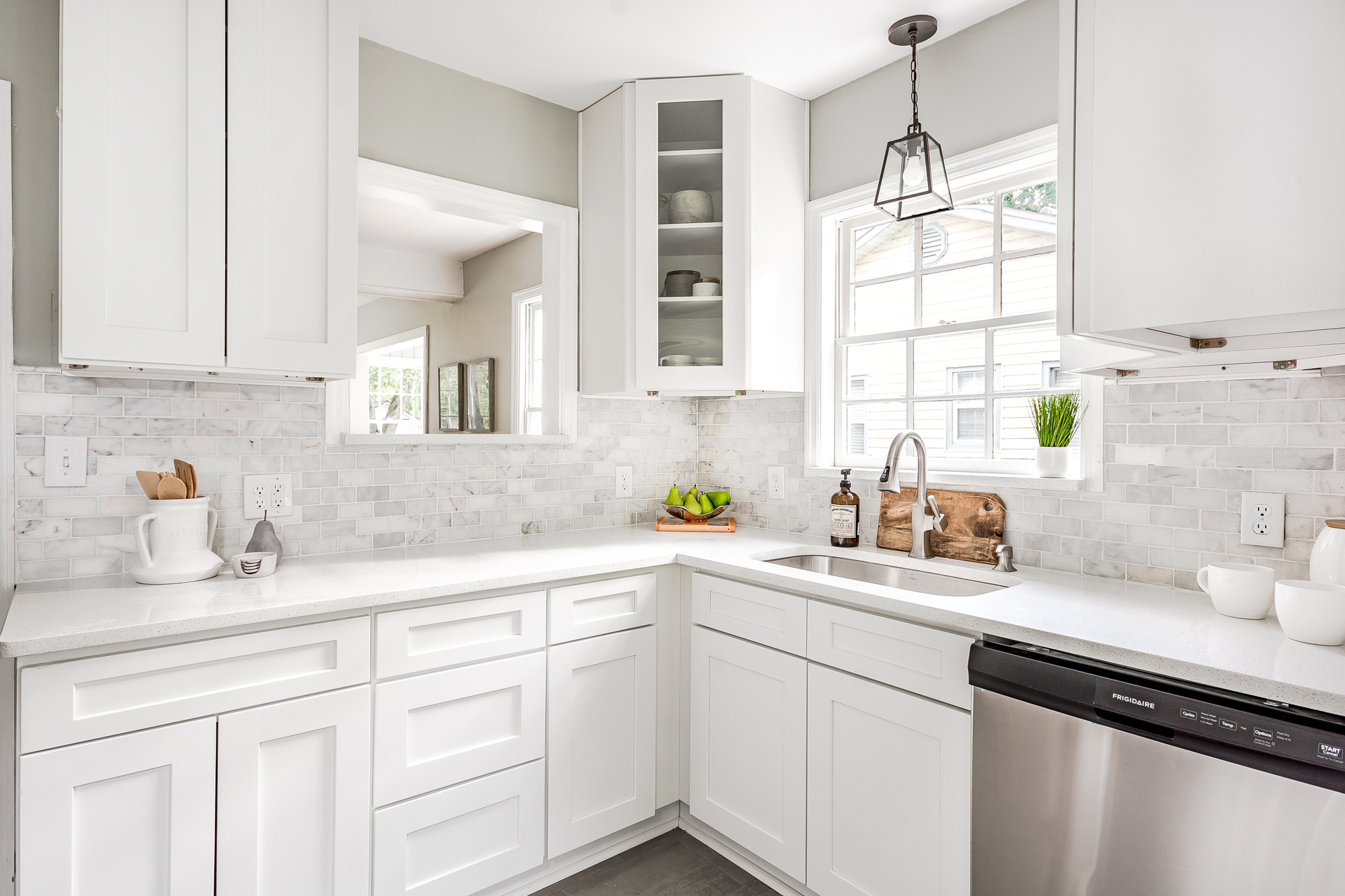
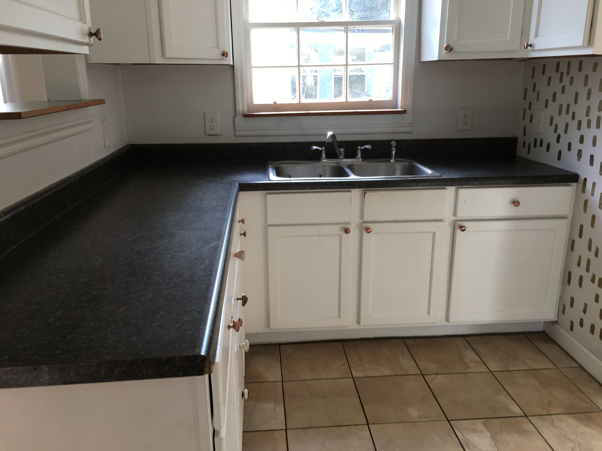
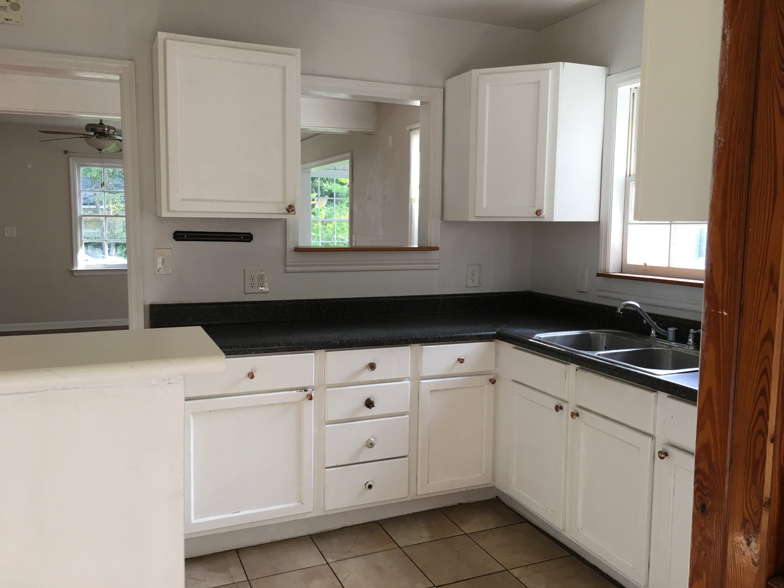
In the before shot the countertops were dark and the cabinets were dated. By bringing in white cabinets, quartz countertops and a Carrara white brick marble mosaic backsplash this kitchen is transformed to white, bright and SPACIOUS!
A dishwasher and 2 open paneled corner shelves were added but other than those minor changes the overall kitchen layout stayed the same. The light now reflects on all of the white, thus bringing more light in - ta da!
I always recommend white cabinets and a light countertop to my clients, especially in a tight kitchen like this one. White will bounce light better and trick your eye into the space feeling larger and for some it’s easier to keep clean. If this is too white and sterile feeling for you that’s okay, it’s easy to bring color in with the backsplash, using a matte glass mosiac tile or the Esenzia Mare Ceramic Tile with a that pretty green / blue hue.
It’s unbelievable how much an updated kitchen and transform a space, this project was renovated lightly before going on the market and didn’t last long - it went under contract in just a few days. The agent that sold the home is incredible and the home simply spoke for itself!
Like I said, this was a good one.
I hope you found some inspiration here, until next time.
See more projects here


